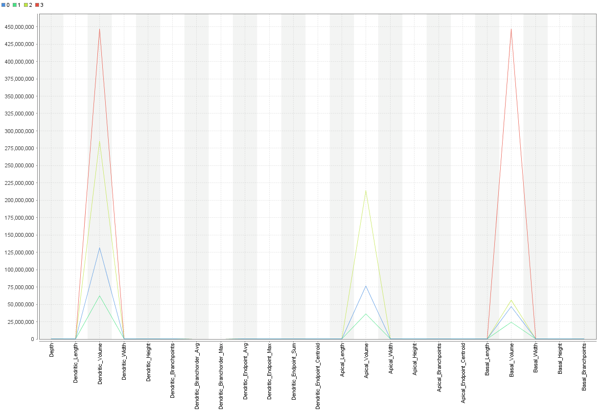
Hello, I am doing clustering using X-mean thhat yields into 4 cluster and in my results I have one centroid table and also a plot option which looks as in picture.
Can comeone kindly explain what does the plot is describing? I couldn't really figure it out by the first look! I guess it showed the features that have been used for clustering and their range...but it doesn't make sense with its shape so I donno
Thanks a lot!