🎉Community Raffle - Win $25

An exclusive raffle opportunity for active members like you! Complete your profile, answer questions and get your first accepted badge to enter the raffle.
Join and Win

"Quantile visualization has odd axes"

User: "Lewisham"
New Altair Community Member
Updated by Jocelyn
Hi again!
Work has gone on apace, thanks to Ingo  :D

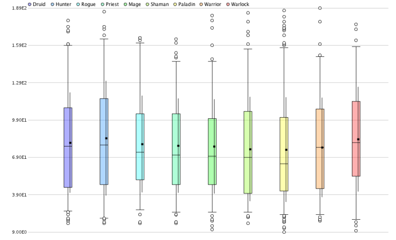
I'm now trying to visualize my results. A good box plot, aka quantile in RapidMiner, chart, would be great.

However, RapidMiner is making odd axes:
image

The numbers along the y-axis have been turned into scientific notation, but they're real numbers in the range of 0-200 or so. There doesn't seem to be an option to edit the y-axis. How can I undo this scientific notation conversion, and just show the actual numbers on the y-axis?

Thanks!

Find more posts tagged with

Sort by:
1 - 2 of 21
    User: "fischer"
    New Altair Community Member
    Unfortunately, you cant'. I agree it's annoying and it'S on the todo list for the next version.

    Cheers,
    Simon
    User: "Lewisham"
    New Altair Community Member
    OP
    Awesome, looking forward to it. I'll just do it by hand for now.