-- originally published in August, 2016
“If you torture the data long enough, it will confess” said the British economist Ronald Coase. I will soften this quote as “If you massage the data long enough, it will tell you its story. ” I find this to be a good visual of what we do in post processing of data obtained through design exploration. We sort it, group it, and color it. We add, subtract, divide and multiply it. We compute its eigenvalues and its regressions coefficients. We do all this to understand the story behind the data and then use this information to make better design decisions.
There are many ways of massaging a dataset. Some are useful for any dataset, some are only meaningful when used on data obtained from a certain design exploration approach such as design of experiments or optimization.
As a general rule, always start with reviewing the data to make sure it is healthy and it makes sense. If the number of unique values are fewer than the number of designs, you need to investigate why different designs may have repeated output values. The same process is valid for Bad Values as well.

Our old friend, the histograms tell us about the ranges our data varies in and how it varies. If you have an upper bound on your response and your response histogram is left skewed; you should be relieved, as that means designs tend to have low response values. If the situation is reversed, meaning you have an upper bound on your response and your response histogram is right skewed, you should think of ways to move the response values to lower ranges. If you have bi-modal histograms; that means there is a design characteristics that splits the performance values into two groups.
Histograms’ first cousins, box-plots, are getting more popular than histograms lately with their superb outlier identification. Outliers can give you eureka moments or they can point you to designs that you were always afraid of.

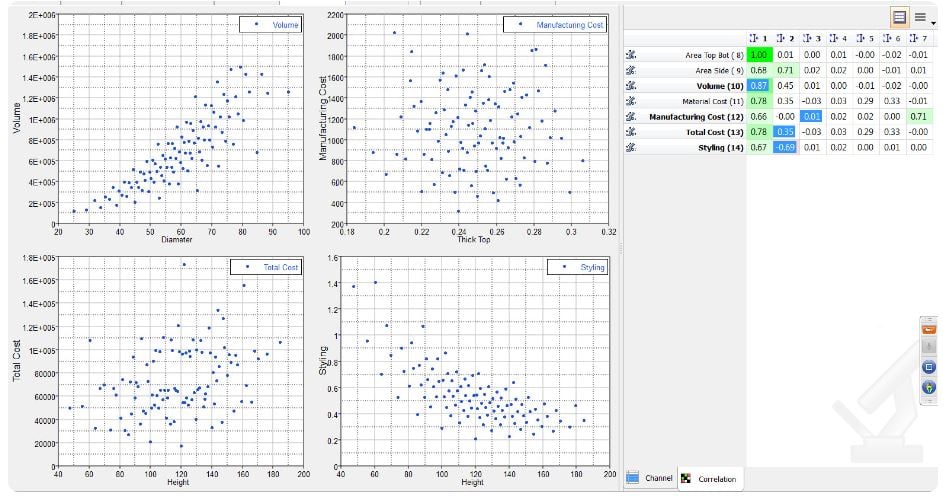
Correlation measures the strength and direction between associated variables. They can be calculated in several different ways depending on the dataset characteristics. When they are displayed with the corresponding scatter plots, they leave a mark in your mind about how the inputs and outputs of a design system may be related to each other.
Parallel coordinate plot looks like a mess at first, but they can tell you about relations and patterns like no other plot can. You can draw a box around a set of vertical lines; such as a box around low cost values, to filter all the designs that are outside this box. You can then see the design patterns that led to the filtered characteristic. You can also display only a subset of inputs and outputs to see the direct relation between them.

Then there are approach specific techniques.
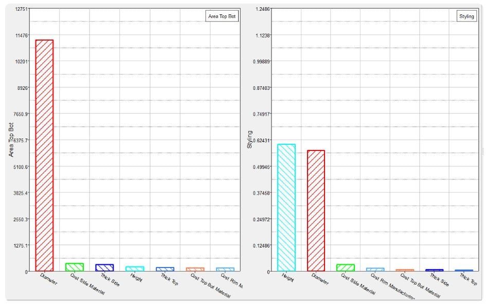
Let’s start this list with Pareto plots which is also named after a famous economist, this time an Italian citizen Vilfredo Pareto. Pareto plots order the effects of variables on responses so you can identify the set of most important variables. Knowing this set will allow you to focus only on the important variables and not waste your resources on varying insignificant variables. Along with histograms and scatter plots; Pareto Plots are considered one of the seven basic tools of quality.
Effects and interactions are what you want to look at for a DOE data to understand the relations between inputs and outputs. In these two charts, effects of variables on responses, ignoring the effects of other variables and the effect of a variable on a response at varying levels of another variable are plotted. During design optimization, we try to pick a set of independent variables but this is not always possible and hence you should never eliminate a variable without reviewing its interactions with other variables.

Iteration history shows you the decisions that an optimization method is taking; so you can see for yourself if the latest hype in optimization method has a merit or not. Evaluation data on the other hand are not judgmental of designs, they will accept all design points and show them. For this reason, where iteration history colors, ranks, groups designs as bad, good, better, optimal; evaluation data just lists them.
My favorite is the trade-off panel that allows you to quickly predict the design performance at different designs using response surfaces. Be careful they can be addictive and of course do not trust them if you have not verified the response surface quality using Diagnostics and Residuals. Both Diagnostics and Residuals help you to assess the quality of a fit by displaying a number of statistical measures.
Let me wrap up my blog with another quote from Ronald Coase that is related to the trade-offs:
“Faced with a choice between a theory which predicts well but gives us little insight into how the system works and one which gives us this insight but predicts badly, I would choose the latter, and I am inclined to think that most economists would do the same.”
Same argument holds true for engineers! Until next time, explore, study, discover!

