When post processing time series or frequency domain CAE results it can be useful to aggregate the results into a single KPI, for example, by taking the maximum or mean over the entire curve or frequency band. When preparing data to create a fit this aggregation approach is often carried over, but may not be the best approach for fit quality. Many complex CAE responses are a combination of many different physical behaviours, this means that in different regions of the design space different behaviours will be dominant. These different behaviours affect not only the magnitude of a peak, but also its position in time or frequency.
To demonstrate this consider the following analytical example with design variables c1, c2, c3 and corresponding curve:
| y1= max [-( 4 - 2x2 ) +c1 ]
y2= max [-( 2 - 1/2x2 ) +c2 ]
y3= max [-( 8 - x2 ) +c3 ]
yEnvelope= max [ y1,y2,y3] | 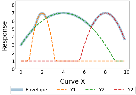 |
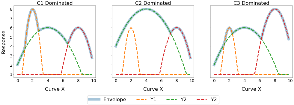
Imagine the three different peaks are different physical behaviours dominated by different groups of design variables. Changing the design variables will drastically alter the shape of the curve and move the peak in both magnitude and position, as shown below.
If you wanted to perform an optimisation using a fit where the peak of the curve was constrained, when would be the best time to perform the aggregation of the curve to measure this KPI? Lets compare the following two approaches:
1. Post process the curve, aggregate into a KPI, create a fit of the KPI - Prediction of the Maximum
2. Create a fit of the curve, then post-process the predicted curve into a KPI - Maximum of the Curve Prediction
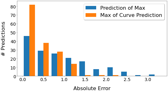
With a linear regression model trained with 333 points and tested on 167 points, we get the following R2 scores (higher is better),
| Aggregation Method | R2 |
| Prediction of Max | 0.6 |
| Max of Curve Prediction | 0.9 |
The second method of predicting the curve and then post-processing to extract the KPI gives a far better result R2 than directly predicting the KPI. If we look at the distribution of the errors shown below, the curve prediction has far more predictions in the lowest error bin, indicating that we are more likely to get a lower error using curve prediction.
Why is this? Let's have a look at the curve's change in response to a change in a single design variable. Below is a 3D plot of the entire curve with 10 different values of C1 and a 2D plot of the KPI value (the maximum of the curve).
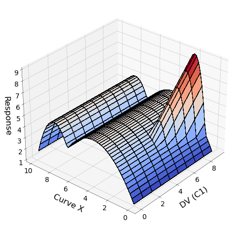
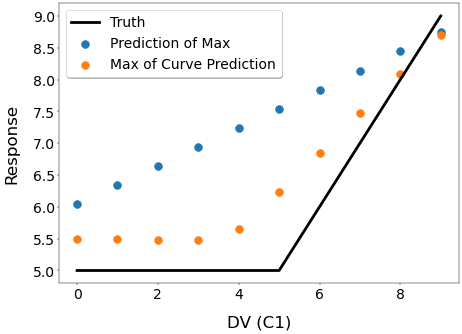
The 3D plot shows that at a value of C1=4 a discontinuity rises out of the surface at Curve X position=2, as the sub-function y1 becomes larger than sub-function y2. The 2D plot shows that this discontinuity is also reflected in the KPI. The direct prediction of the KPI can only display a straight line, however the by taking the max of the curve prediction we can obtain a far better representation of the true behaviour.
When predicting KPI's from curves you should pay attention to the underlying behaviour when choosing your KPI aggregation strategy, especially if the position at which the KPI is evaluated changes. In such cases it can be helpful to predict the underlying curve and then post-process to extract the KPI, a feature coming soon to HyperStudy. This principle also translates to any aggregation, even for extracting peak stress from linear-static simulations where the element with the peak stress changes with changes to the design variables. Luckily we also have a solution for creating a fit of this sort of problem - Field Predictions, available in Design Explorer.
