The Siemens Community Catalyst program was co-created with our community to acknowledge technology leaders who consistently contribute to the Siemens Community. Nominations are accepted on a rolling basis.
hi
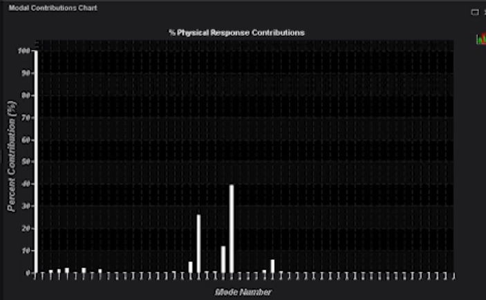
how to plot MPF with respect to output frequency in the form of bar chart or histogram in Hyperview (as shown in below image), so that it represents how MPF is contrubuting to output response for each mode.
<?xml version="1.0" encoding="UTF-8"?>
Did you try NVH utilities in Hypergraph?Refer attached document from help.
Unable to find an attachment - read this blog